
Rebuilding a 300-Year-Old Tea Icon for the Future
Founded in 1706 by Thomas Twining, Twinings is one of the world’s most historic tea brands — a business that helped shape modern tea culture and bring tea to the masses.
From opening one of London’s first tea houses to creating a more progressive and accessible approach to tea drinking, Twinings built its legacy on quality, craftsmanship, sourcing expertise, and the belief that tea should be an experience of discovery and enjoyment.
But despite its extraordinary heritage and premium positioning, the brand had gradually become fragmented over time.
The packaging system lacked cohesion, the architecture had become inconsistent across ranges, and the brand was no longer clearly communicating why Twinings deserved its premium stature within an increasingly crowded and contemporary tea market.
At the same time, consumer expectations around tea were evolving rapidly.
Tea had shifted beyond a traditional beverage into a world connected to wellness, ritual, mood, flavour exploration, functionality, and lifestyle. While herbal and wellness-led tea categories were driving experimentation, black tea remained heavily habitual, with many consumers anchored to familiar choices and lacking confidence to explore the broader range.
BrandSociety was engaged to strategically rebuild the Twinings masterbrand from the ground up — redefining the visual identity system, packaging architecture, communication hierarchy, and broader brand world to reconnect the business to both its rich heritage and future relevance.
Our process began with deep strategic immersion into both brand and society.
We studied the history of Twinings extensively — the original shopfront, historical assets, tea philosophies, craftsmanship principles, sourcing legacy, and the rituals surrounding tea culture. At the same time, we explored the future of the category: changing wellness behaviours, premiumisation, modern lifestyle aesthetics, and the growing role of guided discovery within FMCG.
Rather than simply modernising the brand cosmetically, the ambition was to look backwards in order to move the brand forwards.
The Brandmark

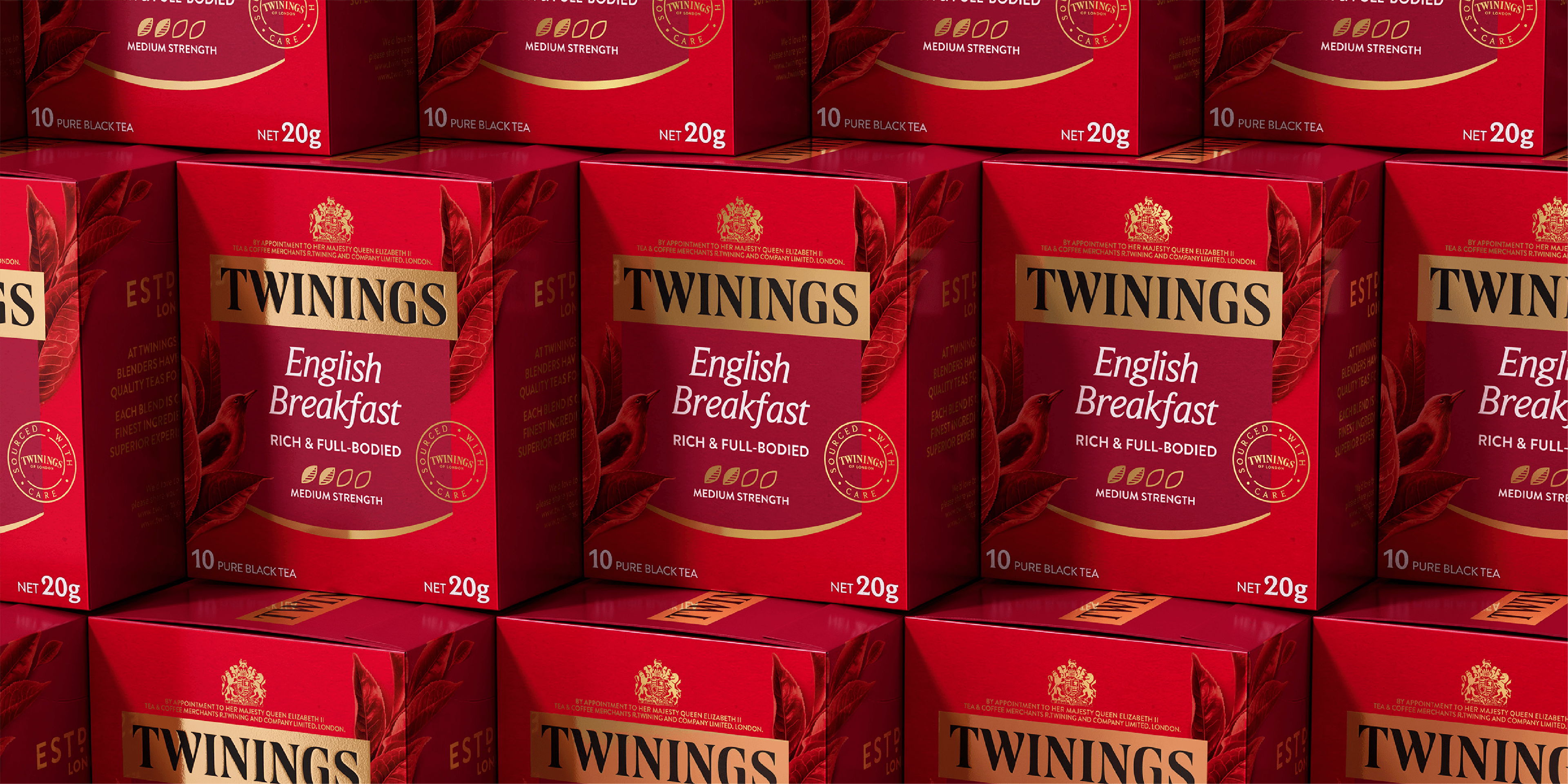
At the heart of the transformation was a complete refinement of the Twinings brandmark.
Paying homage to the original historic logo still proudly displayed above the London flagship store, the wordmark was carefully redrawn and refined with improved proportions, cleaner detailing, stronger legibility, and enhanced balance. Every letterform was crafted with precision to preserve the brand’s historical authenticity while elevating its premium expression for a contemporary market.
The iconic gold block was reinforced as a core Distinctive Brand Asset, while broader brand guidelines were established to restore consistency, confidence, and authority across the entire portfolio.
Visual Identity System

From these foundations, we developed an expansive new visual identity system and creative platform: Elevated Stories.
The platform re-established Twinings as the authority in tea through a world steeped in nature, craftsmanship, provenance, and curated storytelling.
A new branded “wreath” device became a central architectural feature across the packaging system — creating a consistent and recognisable structure while allowing flexibility for the unique storytelling needs of each range, from black teas to fruit infusions, herbal teas, and green teas.
The system was intentionally designed to celebrate the defining values that built Twinings’ reputation: careful sourcing, masterful blending, ingredient distinction, and centuries of tea expertise.
Illustration styles, photography systems, flavour storytelling, colour architecture, and communication hierarchies were all meticulously crafted to deliver a more immersive and elevated experience at shelf.
Beyond aesthetics, the redesign also addressed a significant strategic growth challenge: encouraging consumers to explore beyond habitual black tea purchases.
A new educational communication system was introduced — including flavour descriptors, strength indicators, tasting notes, and clearer blend differentiation — helping consumers navigate the portfolio with greater confidence, curiosity, and enjoyment.

The result was a packaging system designed not only to organise a complex portfolio, but to inspire discovery.
Beyond packaging, the broader Twinings brand world was expanded to connect tea with more contemporary lifestyles and consumption occasions.
The visual language moved beyond traditional tea conventions to create a warmer, more immersive and culturally relevant expression of tea drinking — broadening the brand’s appeal while remaining deeply rooted in its heritage foundations.
From there, future-facing innovation concepts and visual territories were developed to explore what the next generation of Twinings could become — demonstrating how a historic brand could evolve confidently into new formats, wellness spaces, and modern tea experiences without losing authenticity.
The result was a comprehensive global masterbrand transformation that repositioned Twinings as both timeless and contemporary — honouring over 300 years of heritage while building a scalable system designed for future growth.
Today, the Twinings packaging system continues to be recognised by both research and design experts as a benchmark example of exceptional portfolio management and strategic packaging architecture at shelf — proving the power of distinctive brand systems built with both heritage and modern consumer behaviour in mind.